Showing posts with label research. Show all posts

Wednesday, 19 December 2012

Final/ending plan with location shots

The final scen will feature Travis walking into a 'house party'
In this clip I am planning on showing him, walking towards the house, entering the house, greeting people, and then shots of him drinking shots with friends for the final clip as the music starts to blur out.

Examples of locations and examples shots I plan to use :
Although this doesnt show the right house or even the right setting or actor, it shows my desired shot of someone walking towards the house and front door with the camera behind him almost following him into the house.


Another shot within the 'party' will be pouring drinks/shots and drinking them together in a party/friendship atmosphere. Here are some examples of what my shots may look simular too.


I am also hoping to get some lip syncing and performance shots of Travis within the party, I am planning on having a simular style to Kid Cudi's Just what i am video where he is singing and he has the party behind him, hes there drinking with mates, having a good time.

Opening scene. Getting ready examples

typical shots of what Travis might look like getting ready:

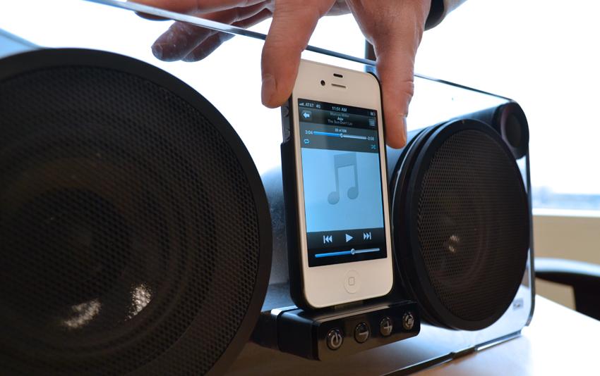
Plus the idea for the very first scene will be him plugging in his ipod, and starting the music to play. An example of what this may look like would be

Monday, 17 December 2012

final video plan

Start/Opening http://www.youtube.com/watch?v=uSD4vsh1zDA - getting ready at home Middle http://www.youtube.com/watch?v=hGbP_kTM4CA - (Kid Cudi Just what I am) party scene with lip syncing

Wednesday, 14 November 2012

Analysis of adverts


This advert's use of colour is very effective,the red on top of the black and white really makes it stand out. Also the use of font is very effective, it uses almost a 'painted on' effect and layers the writting on top of/as well as plain writting. Plus the drawn on barcode and antichrist symbol gives this album artwork a very nice grungey/wild feel.


This is an advert for lil Wayne-tha carter III album. again i like the colours choosen for this advert. the picture of a 'baby lil wayne' is also very effective and by giving the baby the same facial/hand tattoos, jewellary and hair he has fans will instanly recognise this as a baby wayne. The fonts are easy to read, and the use of a quote describing how good lil wayne is, makes audiences think 'this will be good' finished off with sponsers and a website for details makes this a good advert.


 I choose this advert to analysise simply because i like how simple it is. All it says is the brand and a simple sentence, 'introducing the revolution' it is really effective and works very well with the picture of Jay-Z chilling, wearing the brand advertised. i like the simplicity and black and white photo in the shot.


This is another very simple advert by Jay-Z. It is easy to see, it shows the arlbum front cover, the artist, name  of the album and famous songs and release date and a website and sponsor to finish it off. This is another very simple but again very, good advert. Audiences spot who and what it is and also see when they can get hold of the album.


Tuesday, 13 November 2012

music video mood board

These are some ideas, and shots I will be using in my music video. Here is a mood board of them together.

Monday, 12 November 2012

research for final video

In this video i really like the use of drinks as a prop, you can tell they are at a party and they greet one an other through the drinks, 'cheers' and handshakes when they meet. I also really like the clips in the car, they are just chilling out in the car, having fun, enjoying each other company. These are some ideas I will try out for myself to see if they will work in my video.
I also like the effects they have, blurring on the others at the party in the background, scratchy lines etc. I think the grungey finish is really good and effective.

Monday, 5 November 2012

I like this album artwork. Specifilcly the colours used. I like the dullness of the image used and again the red text over the top of it.

Kid Cudi - pursuit of happiness

I like this video a lot. There are two main reasons this video has inspired me: 1. The video has a party/fun atmosphere in it as well as a serious one. I want the same atmosphere in mine, I would like mine to match the mood that this video has captured. In this video it is Kid Cudi with Drake and other friends not only performing/singing the song but also dancing, drinking and having fun. 2. I also like the slow motion used in this video. The whole scene is in slow motion except Cudi. This gives the scene a very good effect and makes him stand out making him almost different to everyone else there.

Monday, 15 October 2012

advert idea

for my poster/advert i am thinking of using another black and white image, with a red box and the date in white within the box (supreme logo idea) saying. 'It's Coming...' underneith

Wednesday, 10 October 2012

digipak ideas


I saw this in a film, and an idea just came to me, that I could maybe use it as an album cover, i could insert the text of the artist name under it, introducing the artist at the same time.

Wednesday, 3 October 2012

name of artist ideas

Jordan Emmerson Wolfe
Harley Mescudi
Kai Arden Blaize
Travis 'Kizz' Zane
Ollie 'kizz' kierans

colour pallet


With this colour scheme I really like the Silvver, rainbow and black. If i were to use these colours I'd probabey also look to involve the red to help make it stand out. I like these colours because of the uniquity it would bring in to the album, although i got my idea to use metalic colours from 'watch the throne' it would still be pretty uniwue as not many other people have used it.


 On these colour pallets I really like the colours, Xtreme Chrome, standard, sparkle and bengal silver. And also silver, twilight, black stardust and silver hyrbrid. these are pretty mixed colours and I think it may be hard to find these colours available to use, but if i were able to find a way to use these colours I tihnk they would look very good, original and effective and would be able to give my CD cover a great finish.


If i were unable to use the metalic colours I'd most liekyl use this colour scheme, I would use this because it would work well with the red box and white font writting, with a black and white image in the background-refering to my CD cover idea. The only problem with this colour scheme is that it's not very original, but i think my box idea, and black and white image background could make it look unique and professional.

Audience profile

The genre of the song, 'Beautiful People' include electro house, dancehall and Europop, and contains influences of R&B. This will allow me into a variety of audiences, they fit into 'Young Alts' abd 'townie' genres, this means the song has quite a wide audience, It doesnt necessarily fit just one 'tribe' but again, it mainly fits into townies and young alts. The audience will tend to wear quite popular brands that range, for example from Vans and topman to addidas originals and nike air max. They will be quite intrested in clubbing/partying and having a good time, they are intrested in night life, which also relates to the meaning of the song 'beautiful people' this is due to the fact that they just want to go out and enjoy life which is what the artist is singing about, 'everyone is beautiful, have fun' this will allow the audience to relate with the song.


Here is an example of what they would usually look like. Caps and other hats are common and usually fit within the young adults age group.

Who, What, Where

Who will I be filming?
I will be filming a handful of my close friends, the idea is to be filming 3-6 lads (which i have in mind) and 2-4 girls, (which I also have in mind) depending on how many lads I end up using

What will be happening in the video?
The video is about enjoying life and having fun, opening up and showing/proving you are beautiful on not only the outside the inside too. this will involve a 'gang' of friends who are out to have a laugh, dancing laughing and showing moments from everyday life as well as having fun working on their music.

Where will i be filming?
I will be filming in Broughton astley, my house and maybe town, or Lutterworth. I have choosen these locations for specific reasons. they all include the type of location i wish to inclucde and when I am filming during night they all have lighting needed to make the shots look very gaffective and professional.

Digipak research

I like this album cover by 'bad religion' it could fit the genre of my work as it is showing religion, which is heavily related to the R&B genre. It also shows class, the person on the front is praying and wearing a suit, this will also fit my genre because R&B artists also have to look very smart and attractive, they like to show of their wealth, and one way of doing this could be to wear a suit. The flag in the background shows where the artist is from and this could also be used to show what nationality he is, and a little to their background.
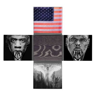
I really like the Jay-Z and Kanye west watch the throne album, and album cover, it is a very unique idea. to begin with i like the fact it has numerous sides on the album, instead of a boring one side an average cd case has. I also really like the colours used in it. It has metalic blacks and silvers used which helps show the 'wild' side, they have been shown to look like wild cats, (tigers) and even the CD and CD holder has black tiger print on it. the american Flag appears again and is the only picture where it has colour on, this still being in a metalic colour which i think looks very affective and allows the whole case to stand out. The outside of the case is also very afective. It is a pattern in a metalic gold  on all sides, which most certainly catches your eye.
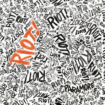

The Paramore Riot album cover is also a very, very affective album cover, it has the album name over, and over again in a handwritten font making it look like almost a doodle book of some sort. The orange font allows the whole cover to stand out and is also affective because of the famous 'orange' hair the lead singer, Hayley Williams has, linking the two. The Riot album work is again very unique and affective.


I also really like these fonts and covers. They are all very basic but also very affective. the red box with white writting is very noticeable and when used on a plain black background or black and white image it looks very good and effective. I really like this effect and look forward to testing it out on my album work


Monday, 1 October 2012

song Ideas: My Song is used to show a 'gang' of people, both boys and girls (mainly male populated) It features personal footage of the artist's everyday life as well as positive video clips of the artists which include an encouragment of getting everybody onto the dance floor and sending the message that they must keep their heads up and discover the beauty that is within themself.

DigiPak

For my DigiPak I am to use this idea/layout. Not only will it be different and effective it will also be a very bold album cover, which will fit the Genre it fits into. I would have to consider how this would be made, as the templates wouldn't fit on an average piece of paper or printer, this means i will not only have to find out how I'd Print it but I'd have to research paper to also see if it can be done to a good standard, without having to stick pieces of paper together.