Showing posts with label digipak. Show all posts

Thursday, 8 November 2012

PRAY.

For my 'PRAY' image on my digipak i had a few queries about whethter I had used all my own photos, and to clarify that I have, I thought it'd be a good idea to show you how I made it.

I started off by using a image i had taken from inside my house a few months back, I used a couple of programmes and apps, for example snapseed to add effects and blur the image. I liked this image, it was the colour i wanted and was the right blurry'ness.


I then chose the basic colour scheme of black font with a white box background. This matched my digipak as the logo travis uses the box around the text also. Another reason to why it matches is because the colours have been used throughout my digipak.
I used the font 'Bebas' which was also used for the title 'TRAVIS' to again allow the target audience to recognise it all fits well together.


I then simple inserted the text on top of the image i earlier made and used this on my digipak (I later unclicked 'show transform controls' for my final image). I used this image as it fitted in very well with the rest of the digipak, it linked through the fonts, colours and even the word i used 'PRAY.' fitted in well with TRAVIS through his religious side which was shown through numerous techniques within the digipak.

Monday, 5 November 2012

I like this album artwork. Specifilcly the colours used. I like the dullness of the image used and again the red text over the top of it.

Over the Sholder shot digipak idea

I really like the over the shoulder shot for the front cover. I will test this idea out on my work and see which one I like the most. Also the picture is in black and white and has red font. I am still very pleased with having this as my choice also. It stands out and i really like the finish, it will also match my genre, not only has kid cudi used it but many other artists that match my genre have used it.

Monday, 29 October 2012

digipak idea

After recieving feedback on my digipak draft, i have decided to remove the 'hello my name is' section on the CD cover. Instead I am going to make it almost as in introduction page, stating who made it and what it's called.
I found an image of what mine may look simular to.


My version of this will be different because it will have different, fonts and font sizes, different colours, and will look unique and obviously include different phrases.

Travis welcomes you to
LIVE YOUR LIFE
faith, believe, hope.
Amen.
 †

Wednesday, 10 October 2012

digipak ideas


I saw this in a film, and an idea just came to me, that I could maybe use it as an album cover, i could insert the text of the artist name under it, introducing the artist at the same time.

Monday, 8 October 2012

digipak

I have found a couple of templates for my Digipak. If I am to use a 'Maltese Cross DigiPak' then I will need to find a printer that can also print in a2 paper as this is the page size that i would need.
39.4 cm by 42.8cm (394mm by 428mm)

Wednesday, 3 October 2012

Digipak research

I like this album cover by 'bad religion' it could fit the genre of my work as it is showing religion, which is heavily related to the R&B genre. It also shows class, the person on the front is praying and wearing a suit, this will also fit my genre because R&B artists also have to look very smart and attractive, they like to show of their wealth, and one way of doing this could be to wear a suit. The flag in the background shows where the artist is from and this could also be used to show what nationality he is, and a little to their background.
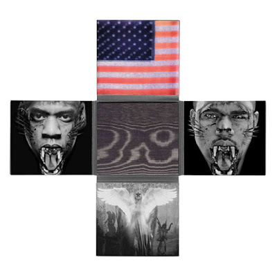
I really like the Jay-Z and Kanye west watch the throne album, and album cover, it is a very unique idea. to begin with i like the fact it has numerous sides on the album, instead of a boring one side an average cd case has. I also really like the colours used in it. It has metalic blacks and silvers used which helps show the 'wild' side, they have been shown to look like wild cats, (tigers) and even the CD and CD holder has black tiger print on it. the american Flag appears again and is the only picture where it has colour on, this still being in a metalic colour which i think looks very affective and allows the whole case to stand out. The outside of the case is also very afective. It is a pattern in a metalic gold  on all sides, which most certainly catches your eye.
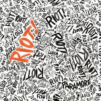

The Paramore Riot album cover is also a very, very affective album cover, it has the album name over, and over again in a handwritten font making it look like almost a doodle book of some sort. The orange font allows the whole cover to stand out and is also affective because of the famous 'orange' hair the lead singer, Hayley Williams has, linking the two. The Riot album work is again very unique and affective.


I also really like these fonts and covers. They are all very basic but also very affective. the red box with white writting is very noticeable and when used on a plain black background or black and white image it looks very good and effective. I really like this effect and look forward to testing it out on my album work

Monday, 1 October 2012

DigiPak

For my DigiPak I am to use this idea/layout. Not only will it be different and effective it will also be a very bold album cover, which will fit the Genre it fits into. I would have to consider how this would be made, as the templates wouldn't fit on an average piece of paper or printer, this means i will not only have to find out how I'd Print it but I'd have to research paper to also see if it can be done to a good standard, without having to stick pieces of paper together.